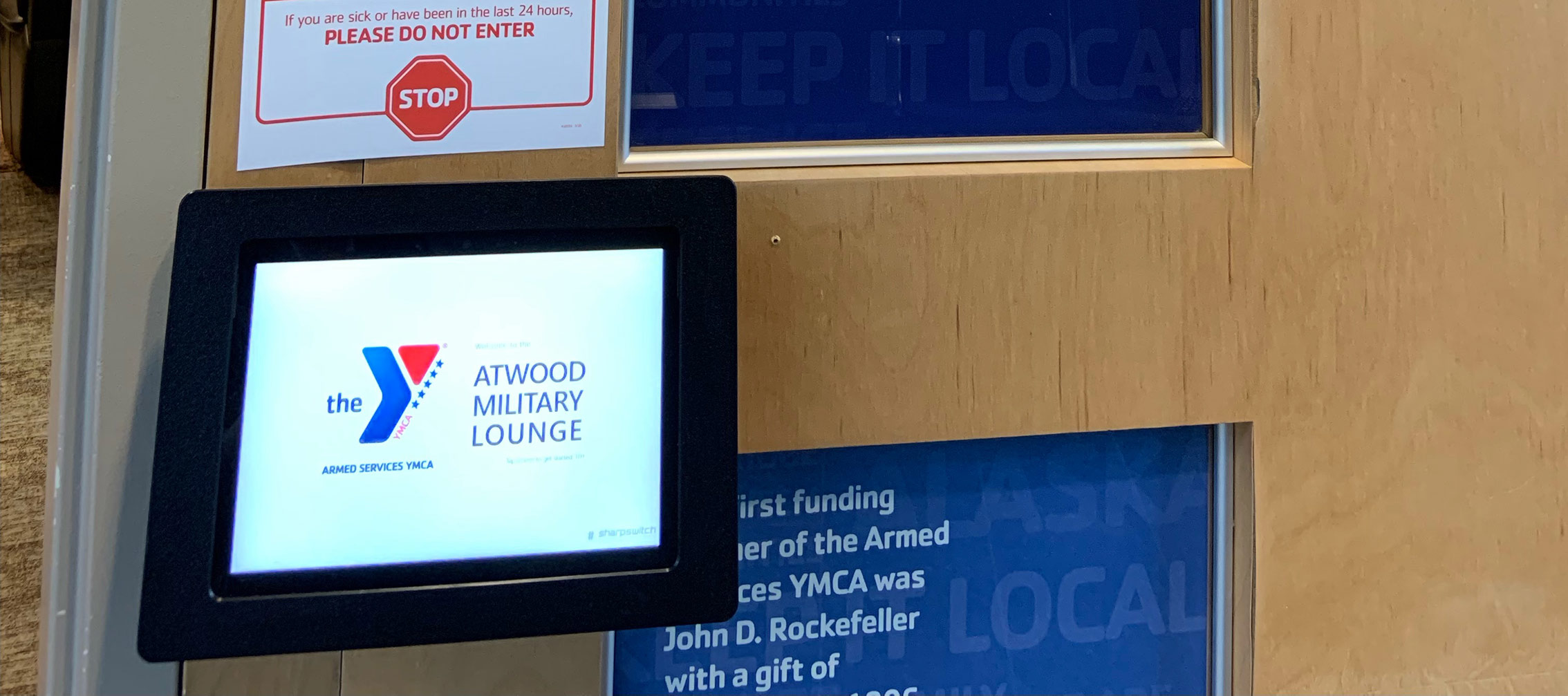
APPG 1 & 2.0 Kiosk Tablet
-
ClientAtwood Military Lounge
-
Year2021
-
RoleProject Manager / Product Designer / App Development
-
StatusOperational
-
Website
Project Overview
We met the director of the YMCA volunteer program in Anchorage Ak on a
business trip, turns out she needed a solution for granting access to the
military lounge after hours and/or when there were no volunteers available.
Sharpswitch specializes in Access Control, so we offered to create a tablet based solution.
Hands on
- Project Management
- Product Design
- Interface Wires, Design and Iterations
- Tutorial/User Guide
- Metric Tracking
- Admin Interface
- Device Field Testing
- Hardware/Case & Installation Design

Opportunity / Goals / Solutions
OAfter hours, volunteer staff members were not available to grant access to the Atwood Military Lounge in Ted Stevens Anchorage Int'l Airport
GCreate a low cost, low maintenance, efficient hardware device paired with a simple, intuitive software interface that would work with the current analog key code door pad.
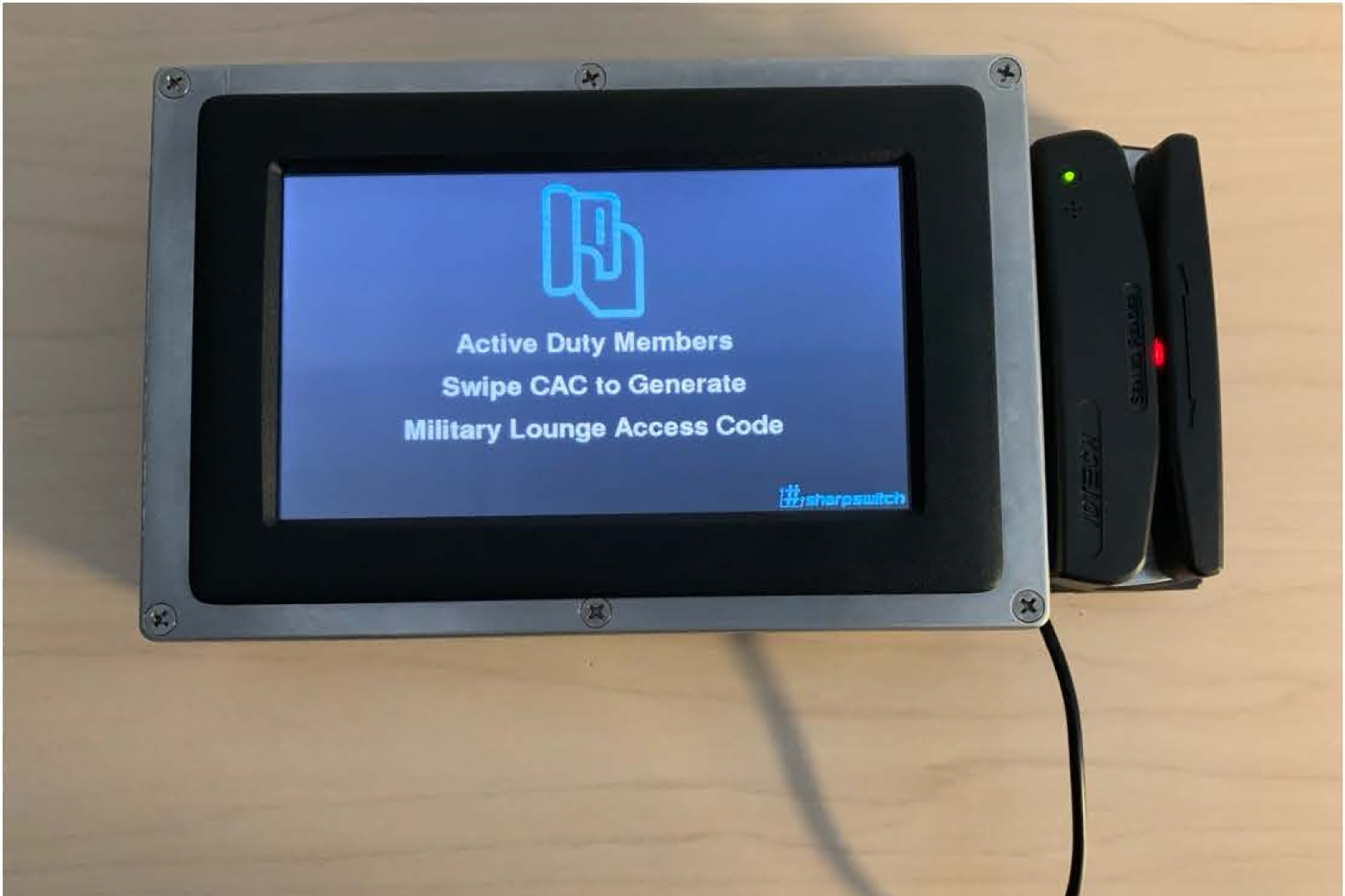
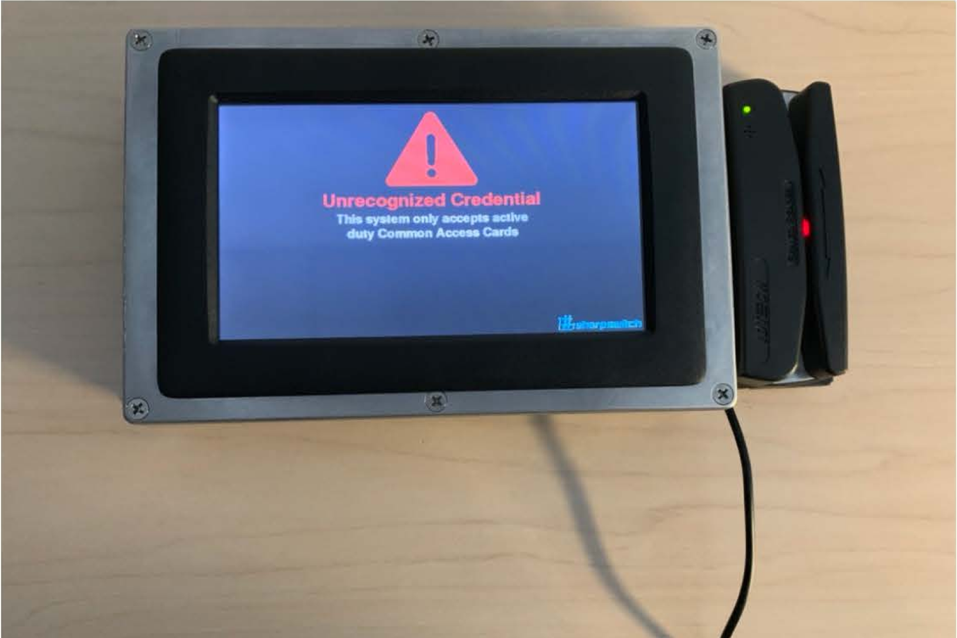
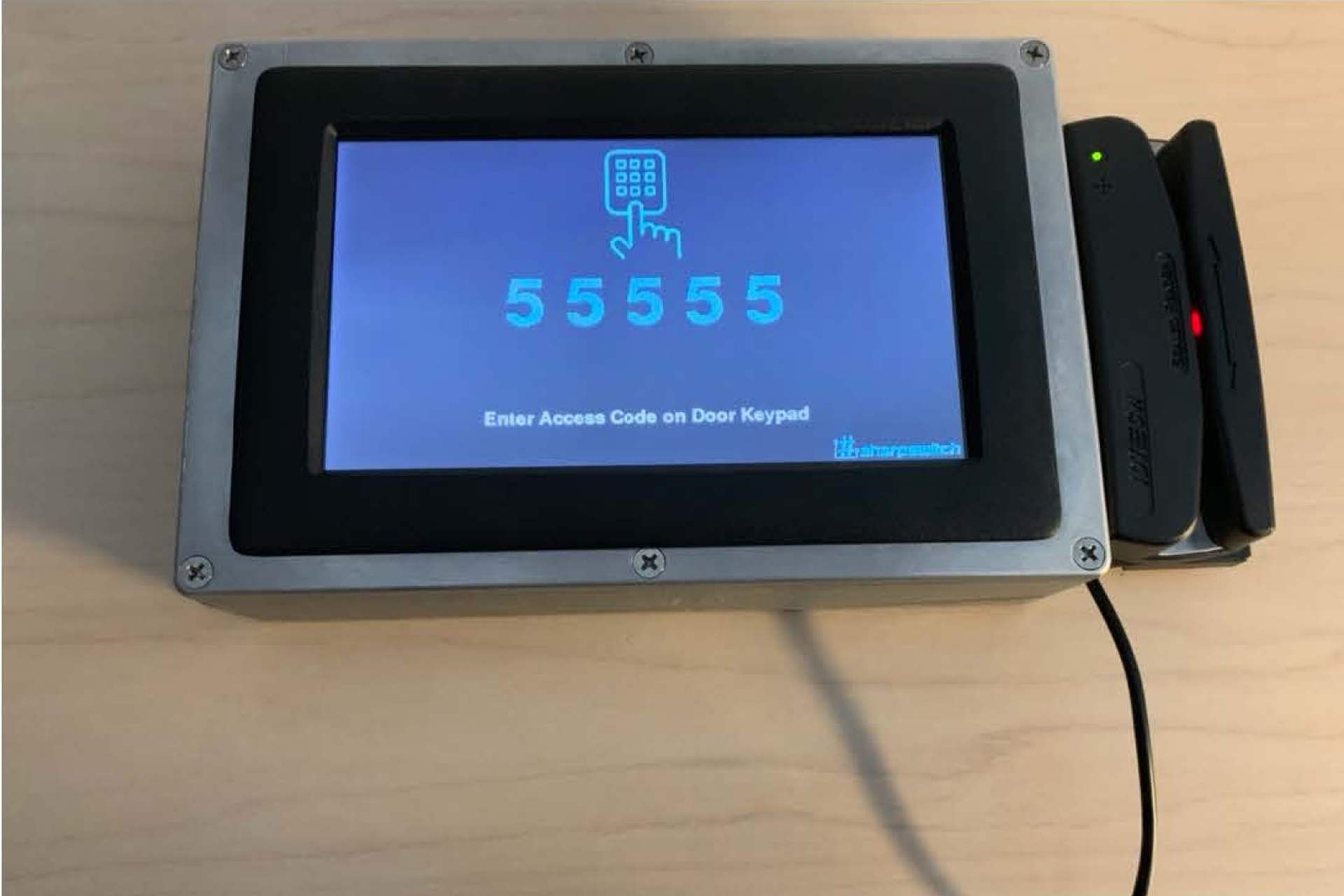
Sv.1 custom built micro controlled physical access device prototype. V.2 Microsoft Surface Tablet with a customized, informational and secure code delivery application for authorized enlisted service members and their families.
Research/Analysis
Our target users are active duty service members aged 18-35, retired members aged 50-90 and their dependents aged 0-100.
Identisys, Verkada and other similar solutions require proprietary hardware that are not government approved. Analog hardware based access control solutions don't support the generation of a door code after swiping an official card.
We found that off the shelf products available were more expensive than the client was willing to pay, so we produced an inexpensive prototype with a micro controller, touch screen with minimal UI, card reader with a custom enclosures.
Implementation
Our small team constructed a prototype, field tested and failed.
Initially we developed the MVP in Angular JS but moved V.2 into Angular.
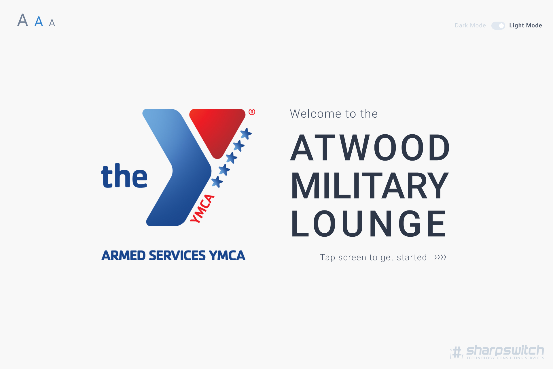
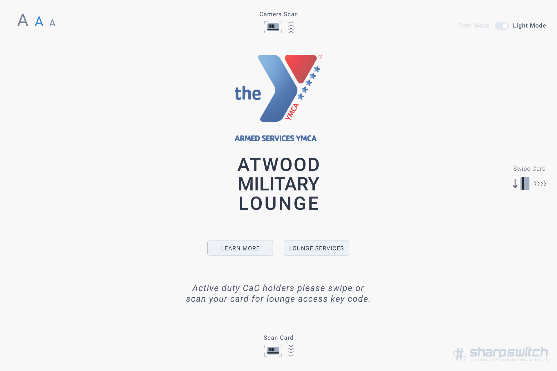
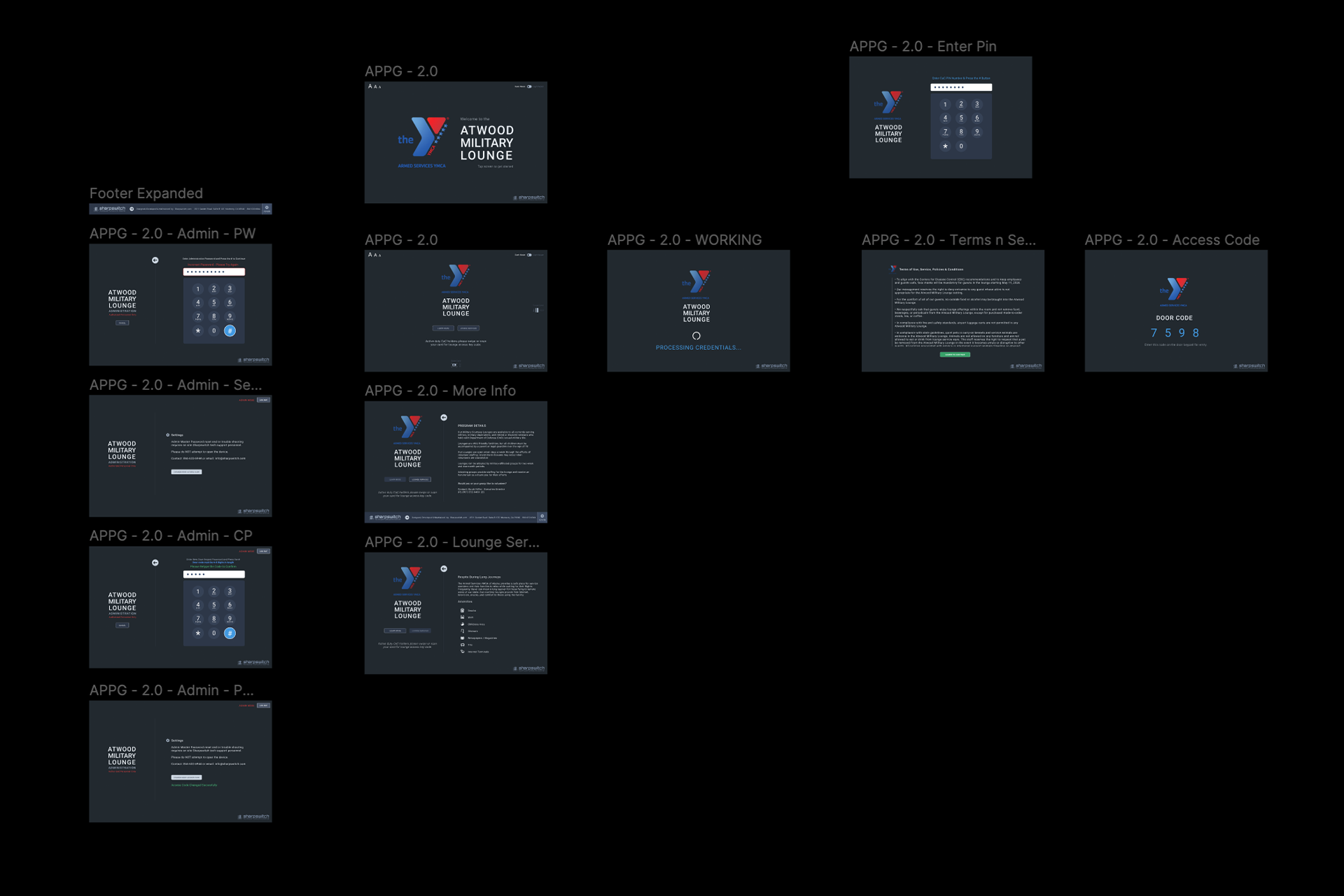
V1.0 wires and UI evolved from 4 screens to include an Administration mode, informational screens, terms of service agreement and contact information.
Validation/Feedback (V.2)
Field testing the prototype device and gathering user experience metrics taught us that most patrons required a larger screen, font sizes and dark mode.
Prototype testing showed that admins had difficulty entering a new door code so we simplified the process by reducing steps needed to complete the simple task.
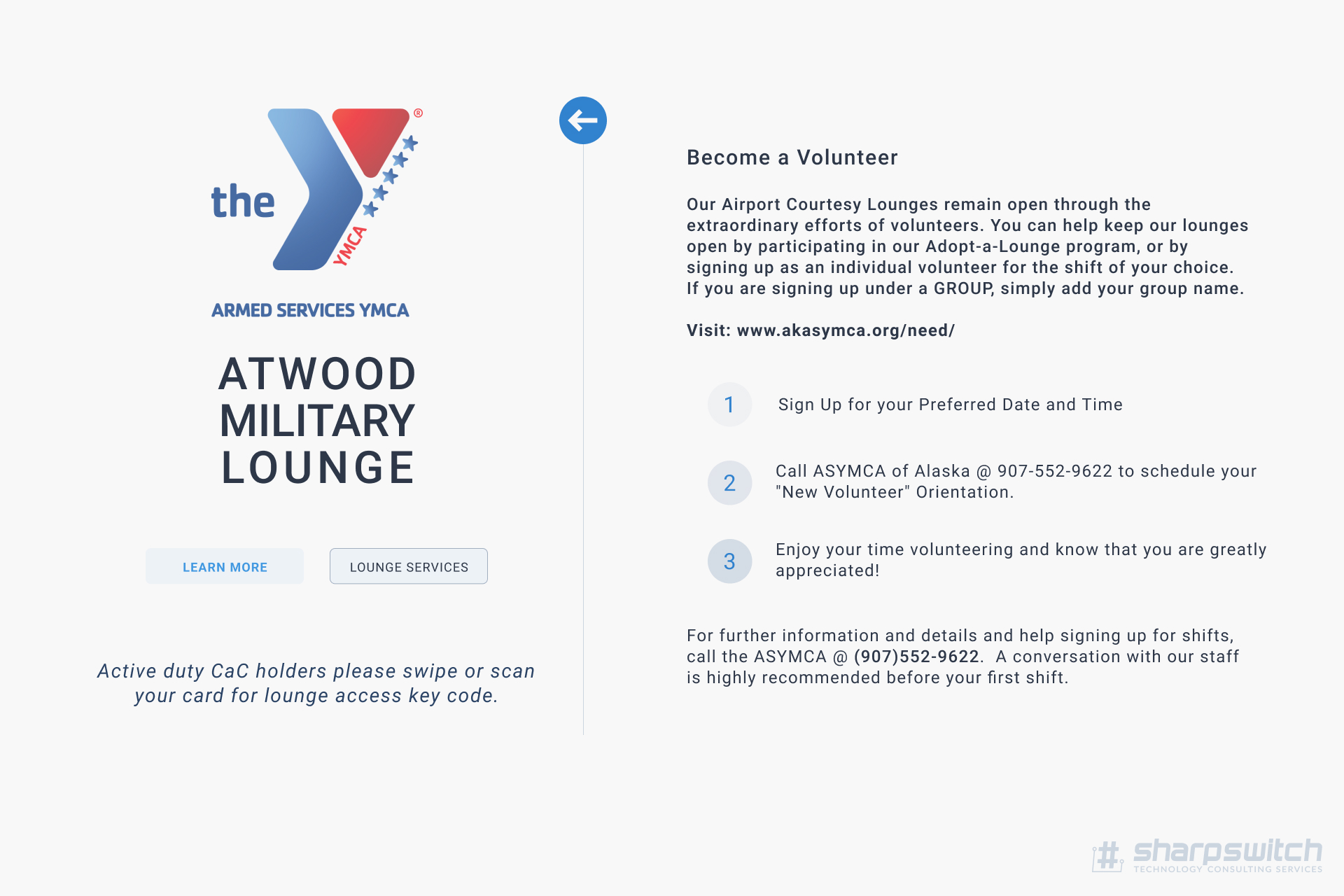
Hi-fi informational screen wire frames were met with great approval as an unforeseen need on the clients side.
Conclusion/Reflection
V.1 was physically abused due to card read errors and device outages. We did not account for human rage.
Initially, we intended on using custom built hardware to provide low cost solutions at multiple locations, however, that solution proved to be ineffective. We upgraded the entire experience by upgrading to a Microsoft surface tablet and locked it into kiosk mode.
V.2 was built stronger, more stable, scalable, cleaner, friendlier and processed transactions much quicker.
Version 2.0 has been running without fault, 100% autonomous for over 2 years now. This has reduced the need to close the lounge when volunteers were not available resulting in rested weary travelers. Win.

